
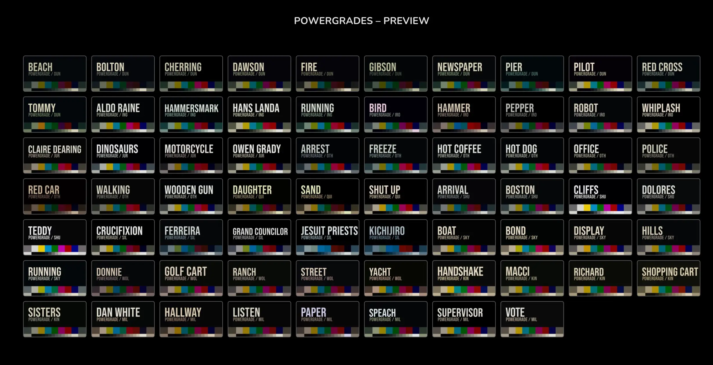
68组好莱坞电影青橙色达芬奇调色节点 这是一套由mononodes出品的灵感来自12部好莱坞电影大片的调色灵感制作的达芬奇调色节点,包含68组节点及用户指南,非常值得学习与借鉴,收藏备用!
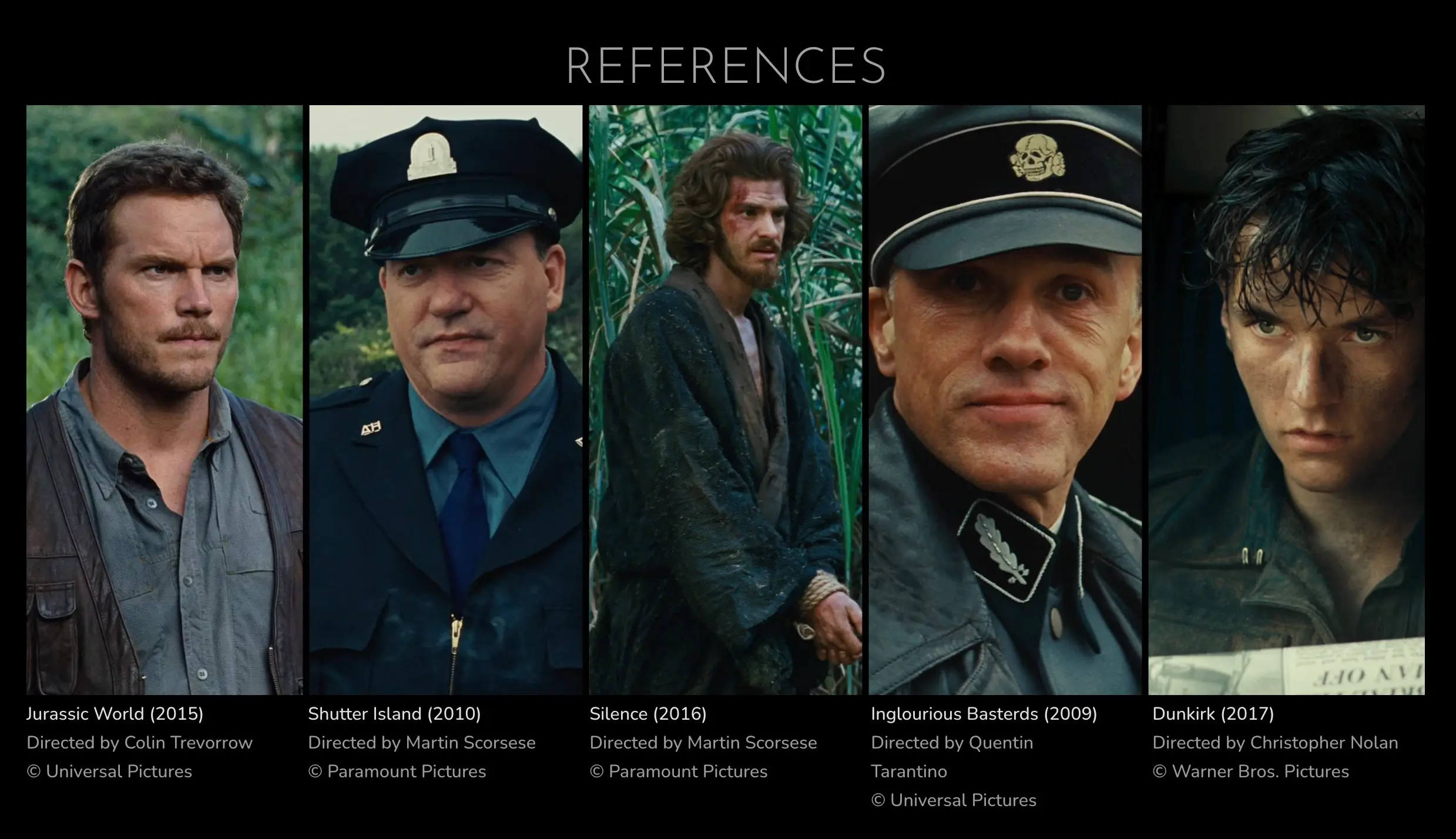
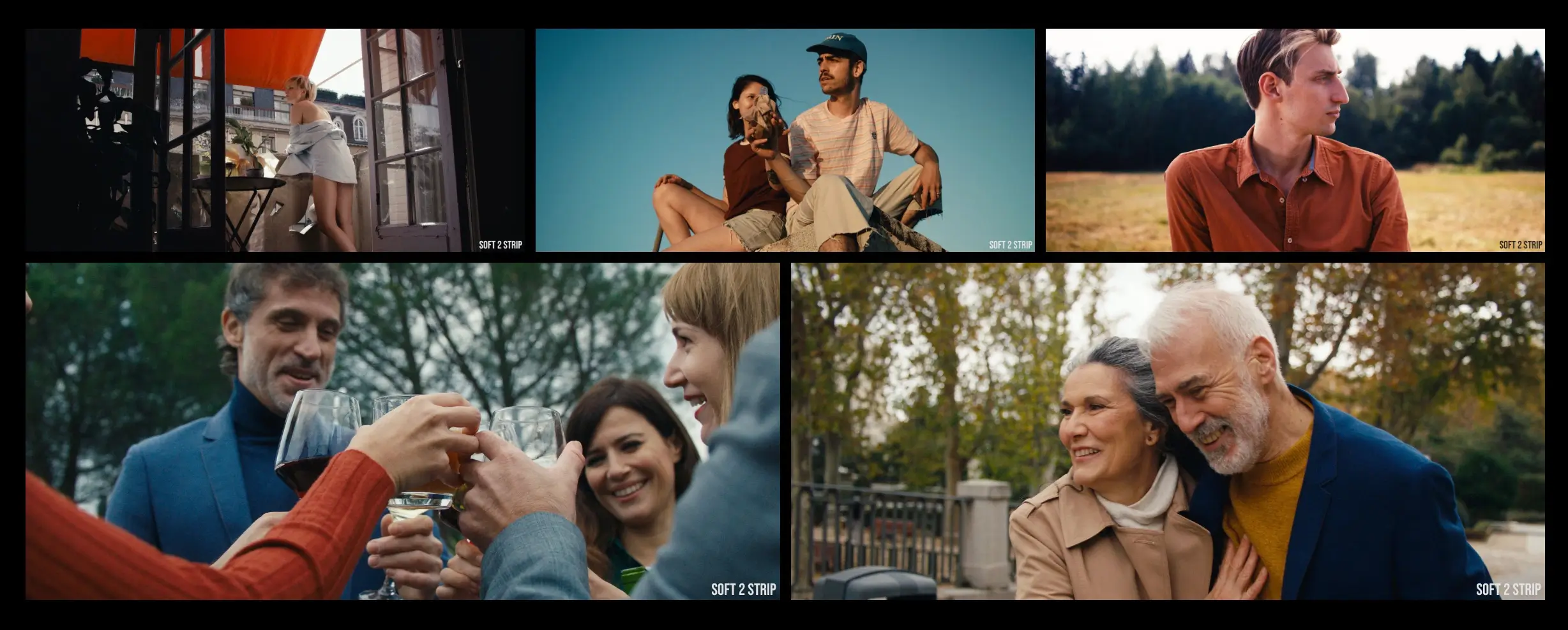
i recently came across films like martin scorsese’s “shutter island” and “silence” which have what i call a “” look. so does “jurassic world” by colin trevorrow and “inglorious basterds” by quentin tarantino. it is a variation of the popular “teal & orange” look, but partly less saturated. sometimes it can look a bit like a “technicolor 2 strip”, but way less harsh than a true “technicolor 2 strip”, so i call the look “soft 2 strip”.
我最近看到了马丁·斯科塞斯的《禁闭岛》和《沉默》等电影,它们具有我所说的“soft 2 strip”外观。科林·特莱沃若的《侏罗纪世界》和昆汀·塔伦蒂诺的《无耻混蛋》也是如此。它是流行的“青色和橙色”外观的变体,但部分饱和度较低。有时它看起来有点像“technicolor 2 strip”,但比真正的“technicolor 2 strip”要温和得多,所以我将这种外观称为“soft 2 strip”。
there are also variations of “that look” … a warmer, redder version in “a quiet place” or in films like “dunkirk”, “iron man 2” and “skyfall” the colors tend to shift towards yellow. here are some references.
“那个看起来”也有多种变化……《寂静之地》中的更温暖、更红的版本,或者在《敦刻尔克》、《钢铁侠2》和《007:天幕杀机》等电影中,颜色往往转向黄色。这里有一些参考资料。
powergrade节点信息:
系统要求:win mac
软件兼容:davinci resolve
文件大小:21mb
官方链接:点我进入
下载方式:百度网盘/奶牛快传/夸克网盘(vip会员专属高速直通)
教程参考:官方英文使用参考
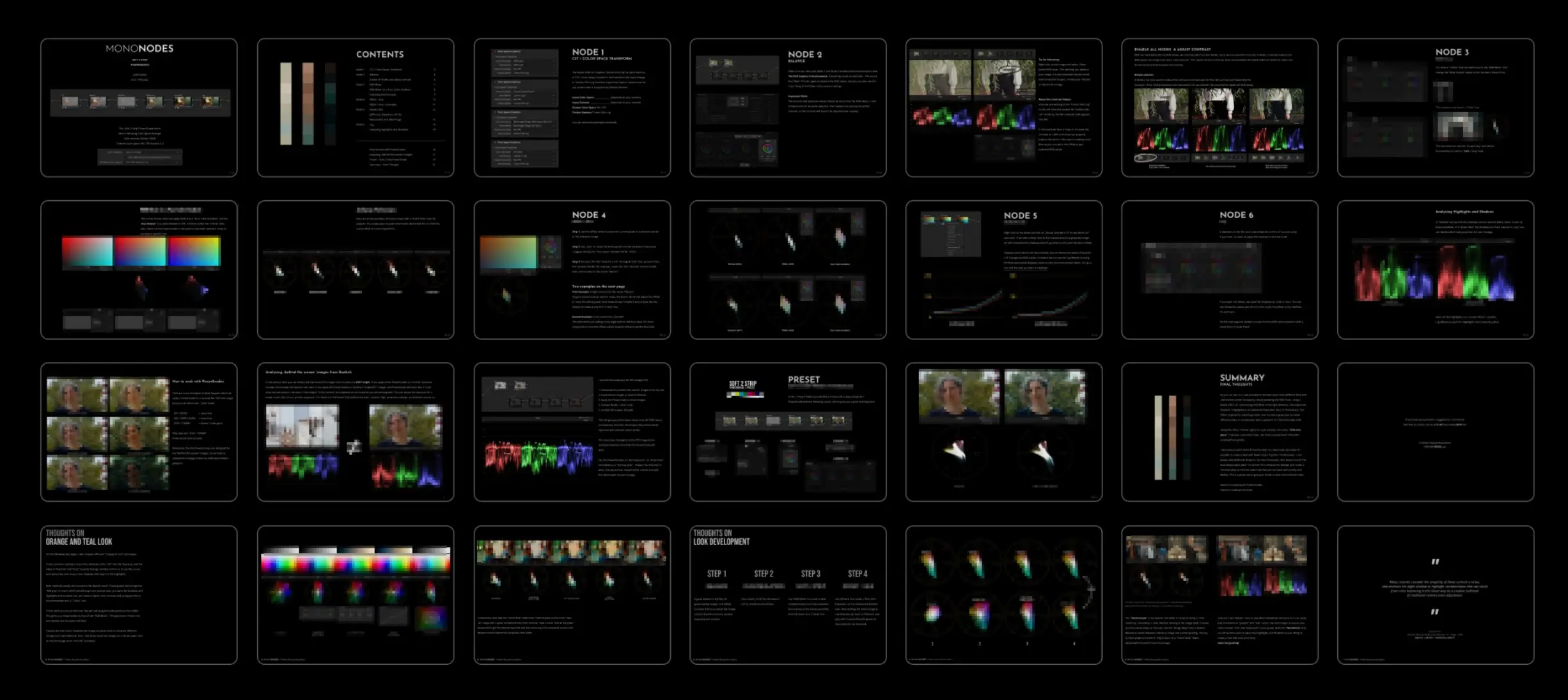
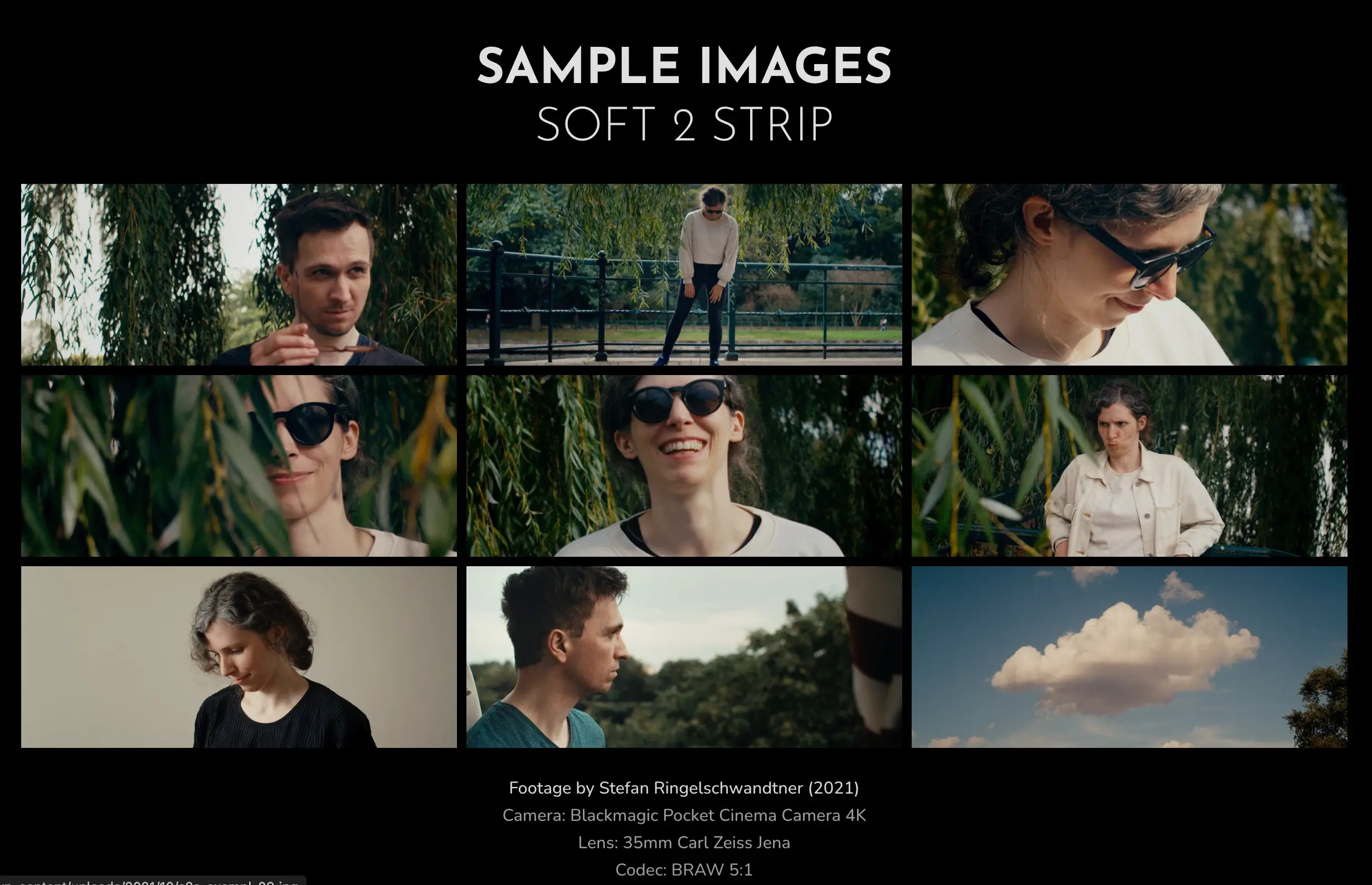
68组好莱坞电影青橙色达芬奇调色节点 图文介绍
其他出品达芬奇dctl插件推荐-持续更新(点击图片查看):
如何在达芬奇中安装dctl插件?
如何在达芬奇中安装powergrade调色节点?
